![]()
![]()
|
|
|
|
|
|
|
|
|
|
|
|
|
|
|
|
|
|
|
|
|
|
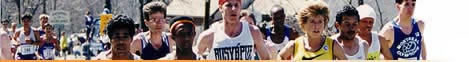
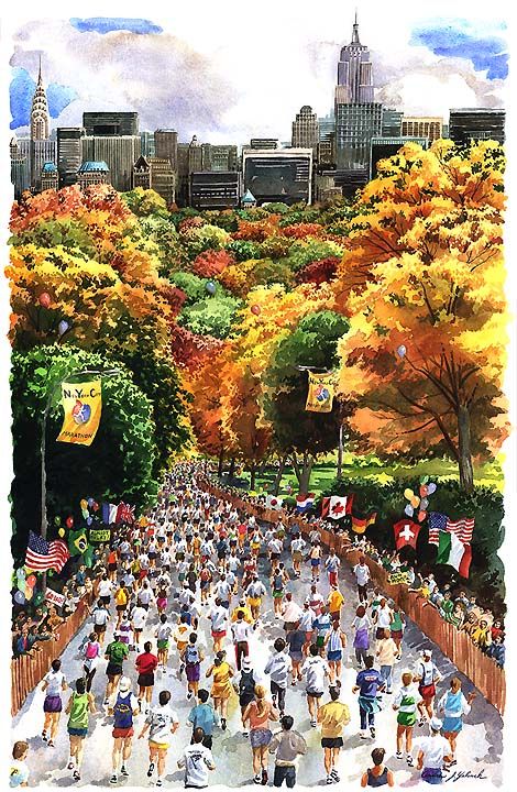
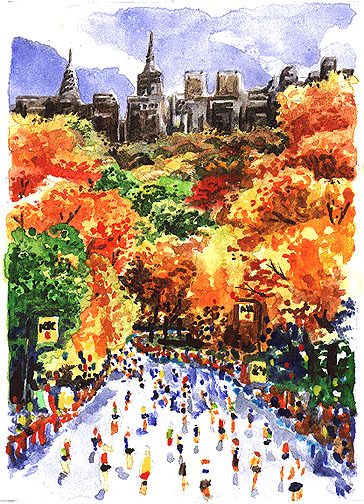
On The Drawing Board The Official 2000 New York City Marathon Poster Marathon artist Andy Yelenak has been selected for the second consecutive year to create the painting for the official New York City Marathon lithograph and poster.The painting is a watercolor produced about 25% larger than the final printed size of the poster and limited edition lithograph. The next step following approval will be shipping the painting to the printer for color separation and printing. The artist, Andy Yelenak, describes the evolution of this painting: The only suggestion I received before designing this painting was to try to include some famous landmarks of New York, particularly the Empire State Building and the Chrysler Building. This is easier said than done due to the nature of the race course. Finding an angle that would show the runners and the two buildings was a challenge. You can see the entire New York skyline from a bridge in Brooklyn, it provides a nice backdrop for the runners, but the buildings are a distance away and don't quite carry the impact as a view from Manhattan would. I've always liked the contrast of the foliage of Central Park with the geometric shapes of the surrounding buildings. By including the Empire State Building and the Chrysler Building towering over the trees of the park, it creates a dramatic view that could only happen in New York.
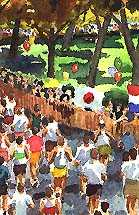
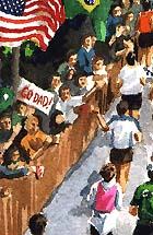
I found a downhill stretch that would allow a chance to see the skyline above the trees. An elevated view is necessary to include both the runners and the cityscape. I took some photos to bring back to the studio that would supply the details for my painting.
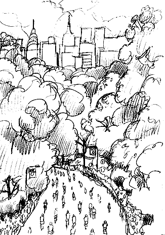
Here's the rough pencil sketch I emailed to the art director for approval. Once we talked through what would be included in this view, I was given the green light to produce a color sketch to show the NYRRC. This small watercolor establishes the colorful fall palette for the painting. Beyond giving the NYRRC a better idea of the final version, creating this sketch helps me solve any problems with color or value I might run into with the larger painting. With watercolor you only get one chance to apply the paint, so this study is basically a practice run with no great penalty for a mistake. The final painting is done on 300 lb French watercolor paper. The base pencil drawing is completed first, then the watercolor is applied over that. I work background to foreground and light areas to dark, building up the value as I go. After the paint has dried, the pencil drawing is erased right through the watercolor with a kneaded eraser. Below are a few details of the finished painting.
The poster and the limited edition lithograph is available
|
See also: Email the artist:
|
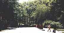 To produce a sketch required a trip to the city with my camera.
I walked the course looking for a spot with potential to include
the skyline along the southern border of Central Park.
To produce a sketch required a trip to the city with my camera.
I walked the course looking for a spot with potential to include
the skyline along the southern border of Central Park.


RP
News | Articles | Trivia
| Profiles | Vintage
Video | Vintage Photos | Contact
Us | Site Map | Home
Cards | Posters
| Autographs | Books
| Pins | Prints
| Authentics | Sportscasters
| How to Order
©
Running Past LLC All Rights Reserved mail@runningpast.com